3D Visualizations in Atlas of Switzerland – online
In the new version of the Atlas of Switzerland, we created a variety of cartographic visualizations that make use of the third dimension. The challenging part for us is to make an intuitive visualization both in 2D and in 3D. A third dimension is clearly an advantage as it can be used to map an additional variable, but at the same time, it has the disadvantage that depth cues lead to misinterpretation of size. Furthermore, although we live in a three-dimensional world, our brain can get challenged when trying to interpret a visualization with too many graphical variables. A 3D visualization can fast lead to information overload and that is something we seek to avoid.
In our atlas, we try to achieve a balance between keeping the maps readable and experimenting with the third dimension. Here are some examples of the visualizations we have been working on so far:
Number of passengers on the main flight routes
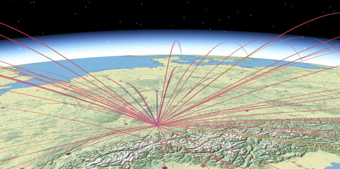
3D curved lines are a technique to visualize paths between a starting point and an end point. With this kind of visualization, a “focus” effect can be achieved by setting only one the starting point. It is then much easier to investigate which are the destination points. An extra attribute can be mapped to the height of the path, for example the approximate flight height.
We used this type of map for the flight routes of the main airports in Switzerland. Darker shades of red represent a bigger number of passengers and lighter shades a lower number. The image shows the destination airports with Zurich airport as starting point.
Cableways according to installation type
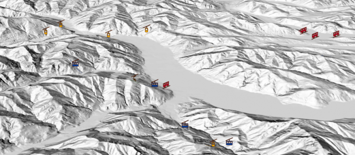
A common 3D representation of simple point data is a billboard. In a 3D space, a billboard will rotate to always face the direction of the camera. It can store images (as PNG), but also vector data (as SVG).
We used several SVG symbols to represent the different types of mountain cableways: cable railway, funicular, shuttle cableway.
Population development in Europe
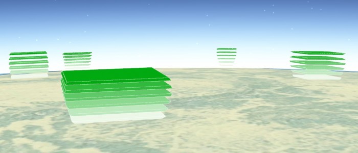
The height axis can nicely be used to show variations over time. With the stacked pyramid frustums, the user quickly understands the temporal change of a variable. What is interesting about this visualization, is that on the horizontal plane, top and bottom surface areas represent thematic variables at sequent points of time. In this way, the slope of the lateral surface shows the change of the parameter between the two time points.
In 2D however, this kind of visualization loses the temporal dimension and can only display a variable at one time point.
In our map the resident population of different European countries is represented as a stack of pyramid frustums. Each frustum represents the population of one year, from 1960 (bottom layer) to 2010 (top layer). A closer look at the visualization allows discovering a general growing tendency, although some countries’ population declined in the past 20 years.
Population distribution by age in Switzerland
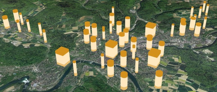
A 2D coin chart is a visualization type already used by Eduard Imhof in 1972. The way it works is that one uses several units and each unit has a specific value (for example a square is 10000). Different units can then be summed up like coins in a wallet. With this kind of visualization in 2D one can only map at most two attributes – the quantity can be mapped to the charts and color can be used to map a qualitative attribute. The third dimension gives then the possibility to map a third attribute. In addition, the coin chart visualization type is used to depict spatial structures like areas with different population density.
We used a 3D coin chart to display the population distribution in Switzerland. The source data for this map was a grid with the number of inhabitants. We calculated each chart by summing up the values in neighbouring cells. One attribute is the number of inhabitants: a cuboid represents 5000 inhabitants, bigger cylinders 1000 inhabitants and smaller cylinders 200. The height axis depicts different age groups: 0-14, 15-64 and over 65 years old (from bottom to top).
Wood heating systems
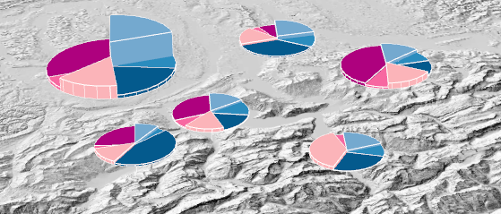
2D pie charts are a common technique for visualizing relative values. However, a pie chart gets more interesting when we add a third dimension. Occlusion 3D pie charts or pie sectors can easily be avoided in a 3D map by simply choosing an alternative viewpoint.
In this map, we used a 3D pie chart for each canton to visualize heating systems based on wood. The height of a pie chart sector represents the number of these heating systems. Pink sectors comprise wood heating systems including wood processing and pellet power. Other wood-based heating systems are represented by blue sectors. Lighter colors indicate less capacity, while darker colors stand for higher heating capacity.
Number of flight passengers during a day
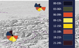
In comparison to pie charts, 2D wing charts can be used with absolute values. There are two graphical variables that we can use, one is the radius of each sector and the other one is the color. It is important that the sector’s angle stays the same so that the user can compare the areas of the different sectors correctly.
In this map we used a 2D wing chart as a billboard to show how many passengers use the airport at certain time slots. Each color represents a 3-hours time slot and the radius of each sector signifies the number of passengers. We can see from the two airport wing charts that between midnight and 6 am there are almost no passengers, and that there are big differences in flight traffic during daytime. The elevated position of the billboards facilitates the perceptibility and localization of the airports in the 3D map.